
Red isn't the only color for red packets. Discover the cultural symbolism behind gold, pink, green, blue, and white in red packet design — and how to choose colors that match your brand and occasion.
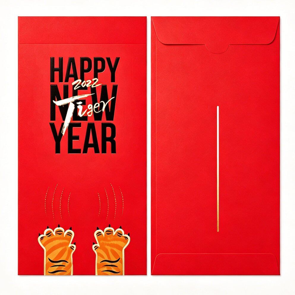
More Than Just Red: The Language of Color in Red Packets
When most people think of red packets, they picture bright red envelopes stuffed with cash during Chinese New Year. But the tradition of red packet color goes much deeper — and for brands creating custom red packets, understanding these meanings is essential for designing envelopes that resonate with recipients.
Every color carries cultural weight. Choosing the right shade can elevate your brand message; choosing the wrong one can send unintended signals.
The Core Colors and Their Meanings
Red: Luck, Prosperity & Joy
Symbolism: Good fortune, happiness, vitality, celebration
Best for: Chinese New Year, weddings, grand openings, any celebration
Red is the universal standard for red packets. In Chinese culture, red wards off evil spirits and attracts positive energy. It's the safest and most expected color for any festive occasion.
Design tip: Use bright, saturated red (not dark maroon) for traditional events. Deep burgundy works well for premium or corporate editions.
Gold: Wealth, Status & Prestige
Symbolism: Prosperity, royalty, high value, achievement
Best for: Corporate gifts, VIP events, luxury brand packaging, CNY premium editions
Gold is the second most popular color for red packets, often used as an accent (foil stamping on red) or as the dominant color for ultra-premium presentations. It signals wealth and importance.
Design tip: Gold foil on a red background is the classic combination. Full gold packets work best for executive gifting or milestone celebrations.
Pink: Romance, Tenderness & New Beginnings
Symbolism: Love, sweetness, youth, fresh starts
Best for: Weddings, baby showers (满月), Valentine's Day, young-audience brands
Pink red packets are popular for weddings and celebrations of new life. They soften the traditional red into something more delicate and romantic.
Design tip: Pair pink with gold foil for weddings. Pair pink with white for baby-related events.
Green: Growth, Health & Harmony
Symbolism: Nature, renewal, vitality, harmony
Best for: Eco-friendly brands, spring-themed events, health and wellness occasions
Green is less common in traditional red packet culture but has growing appeal for brands emphasizing sustainability and natural values. In some Southeast Asian Chinese communities, green is associated with prosperity through growth.
Design tip: Green works beautifully on kraft paper for eco-brands. Avoid mixing green with red in the same design (cultural clash).
Blue: Trust, Stability & Wisdom
Symbolism: Calm, reliability, depth, immortality (in some traditions)
Best for: Corporate events, tech brands, academic celebrations, non-traditional designs
Blue is the most "modern" red packet color. It breaks from tradition in a way that signals innovation and forward-thinking — perfect for brands that want to honor the tradition while standing apart.
Design tip: Navy blue with silver foil creates a sophisticated corporate look. Light blue works for academic or youth-oriented events.
White: Purity & Simplicity (Use with Caution)
Symbolism: Purity, cleanliness, but also mourning in traditional Chinese culture
Best for: Modern minimalist designs as an accent, never as the sole color for traditional recipients
White is tricky. In traditional Chinese culture, white is associated with funerals and mourning. However, in modern design contexts — especially for Western or younger audiences — white can represent clean minimalism.
Design tip: Use white only as an accent or background element. Never make a fully white red packet for traditional Chinese recipients. White + gold foil on a pastel background is acceptable for modern luxury branding.
Black: Power & Sophistication (Niche)
Symbolism: Authority, elegance, mystery
Best for: Ultra-luxury brands, fashion-forward designs, exclusive events
Black red packets are a niche but striking choice. They signal exclusivity and premium positioning. Common in high-end fashion and luxury brand packaging.
Design tip: Black + gold foil is a power combination. Use premium paper (textured or pearl) to justify the bold choice.
Color Combinations That Work
Red + Gold: The classic. Safe, universally recognized, perfect for traditional events.
Red + Silver: Modern alternative to red + gold. Cool, sophisticated.
Pink + Gold: Romantic, ideal for weddings and celebrations of new life.
Navy + Silver: Corporate elegance. Perfect for business galas and executive gifting.
Kraft + Green ink: Eco-friendly authenticity. Natural, grounded.
Black + Gold: Ultra-luxury. High fashion, exclusive events.
Burgundy + Copper: Warm, autumnal, sophisticated. Great for year-end events.
How to Choose Colors for Your Custom Red Packets
Start with your brand colors: Can your brand palette work within red packet conventions? If your brand is blue, consider navy + silver rather than forcing red.
Consider your audience: Traditional Chinese recipients → stick to red/gold. Younger or Western audiences → more freedom to experiment.
Match the occasion: CNY → red. Wedding → pink or red. Corporate → your brand palette with metallic accents.
Test in physical form: Colors look different on paper than on screen. Always request a physical proof before full production.
Cultural Pitfalls to Avoid
Never use fully white or fully black packets for CNY or weddings (associated with mourning)
Avoid green hats or green-related imagery (cultural taboo in Chinese culture)
Don't mix funeral-associated colors (white, plain black) with celebration imagery
Be cautious with purple in some Southeast Asian cultures (associated with mourning in Thai culture)
Not sure which colors work for your event or brand? Aorai Pack provides free color consultation and physical sample proofs with every custom red packet inquiry.